Client: Microsoft
Optimizing Knowledge for AI
Role: UX Specialist, Web Designer
Duration: 3 months
Problem Statement
What is the best way to take individualized knowledge and bring it to the collective and get ready for AI?
Solution:
To assist individuals in their work, a user-friendly website was established, providing self-service access to essential knowledge. Its goal was to empower users with the background information necessary for more informed discussions with their legal experts. This website was just one component of a broader strategy that involved creating a Customer Relationship Management (CRM) site. The aim was to update and streamline the tasks performed by the legal team. By consolidating knowledge from separate sources into a central website, the team not only improved collaboration but also set the stage for potential integration with artificial intelligence in the future.
I created a Sharepoint website from the ground up incorporating user-centered design best practices. Given tight timeframes for this project the approach taken was to build the site first as a proof of concept and then seek feedback from the customers.
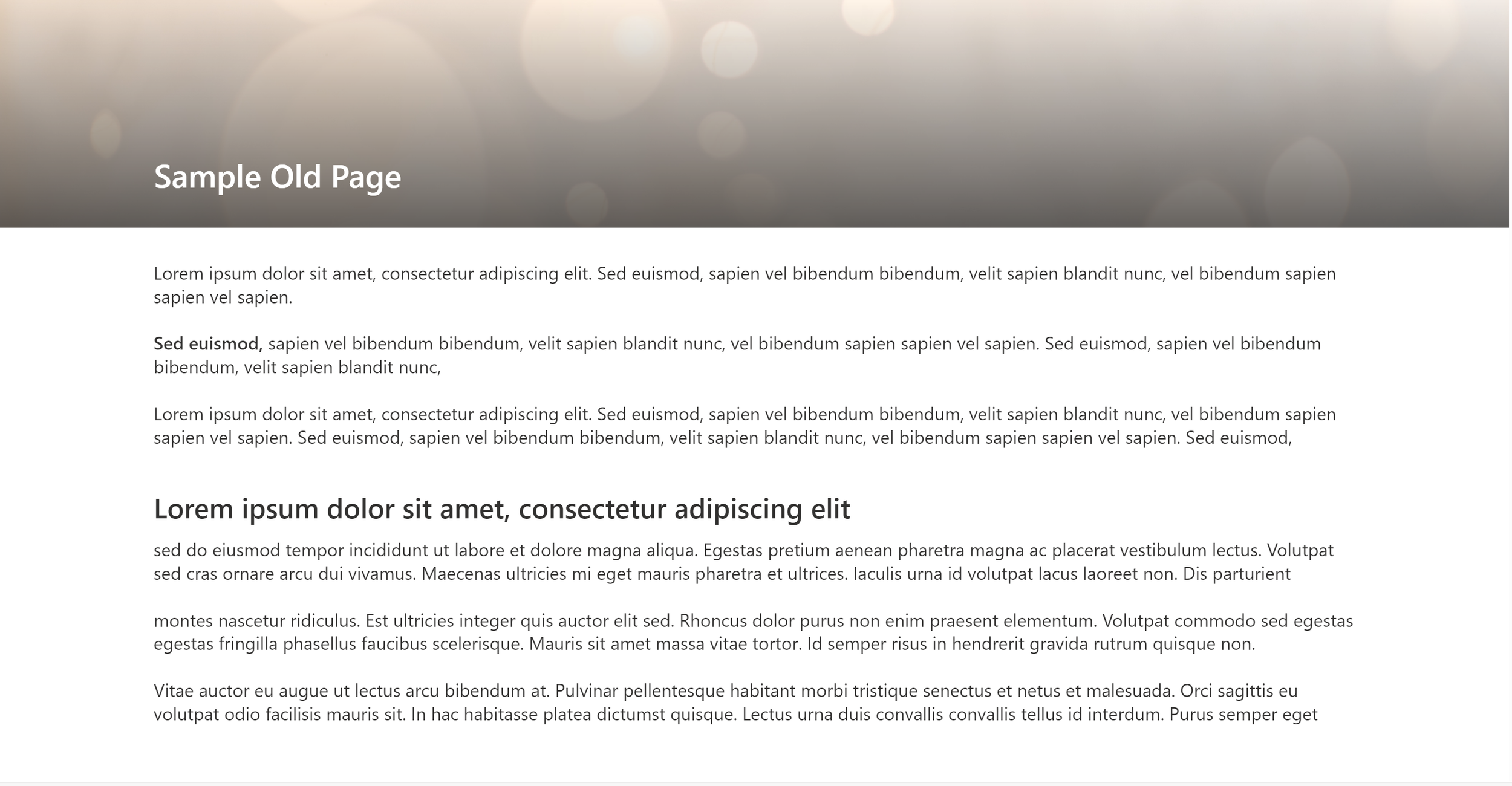
Before and After
Key Design Principles
Wayfinding
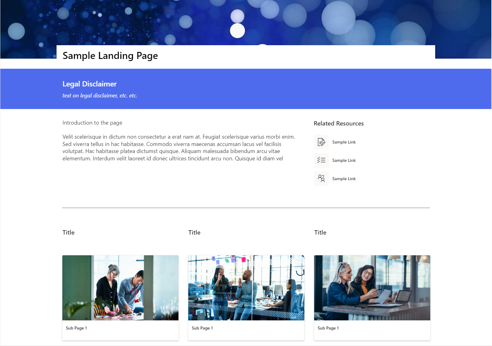
Each page started with a brief overview of the content on the page so that the user could quickly understand if they were in the correct place and should continue on the page or look elsewhere on the site. Customers may not be familiar with legal jargon and may not know exactly what they are looking for or there may be overlap between different pieces of knowledge on the site. Therefore, each page has Related Resources at the top to try and quickly connect users with the related information they need if it’s not found on the page itself.
Transforming Legal Writing to the Web
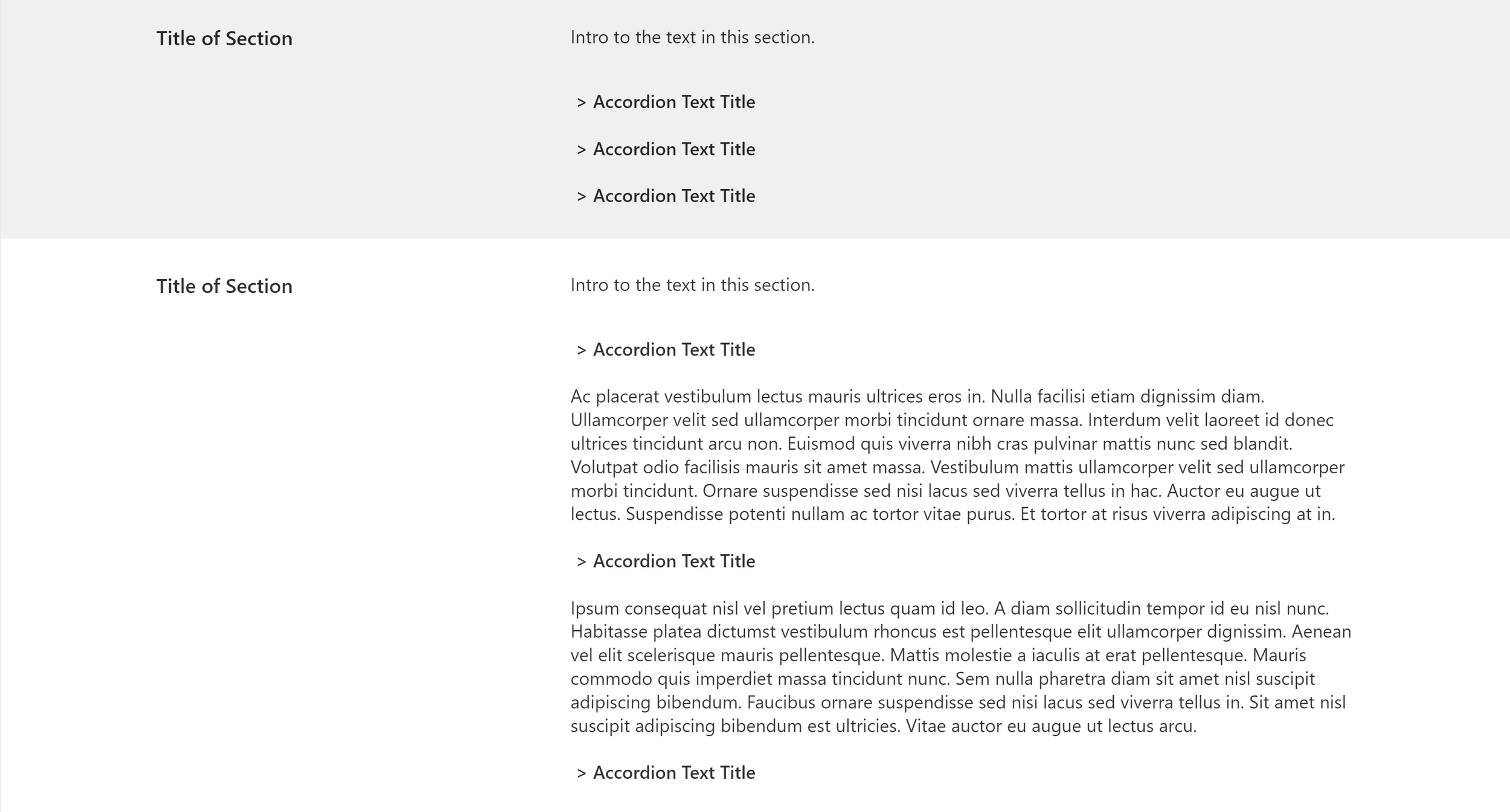
The nature of legal work is that it tends to be verbose. The design team tried to help the legal experts understand how to write for the web but it's not always possible to succinctly provide the detailed legal information that needs to be conveyed. To help solve for this, headings were paired with collapsible text. That way a user can scan the page to find the content relevant to them and then expand the content to get in depth information without making the page visually overwhelming with text.
Visually appealing
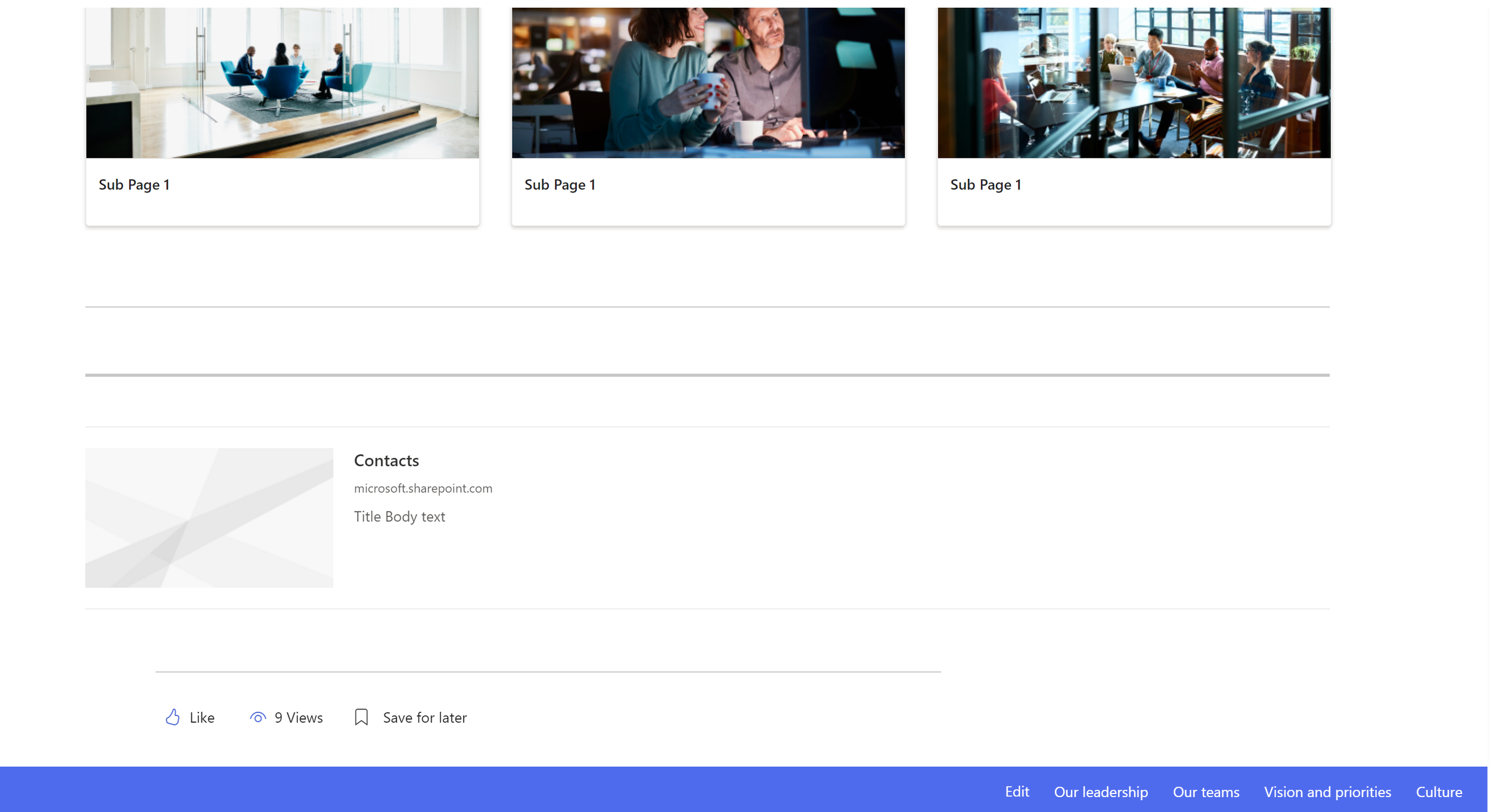
Much of the content was text heavy but where possible on any pages that had less word-based content more visual imagery was used so that the site was well balanced and user fatigue mitigated.
Hierarchy
Placement of Contacts in a less prominent position at the bottom of the page presents a tension between the needs of the different user groups. Ultimately the needs of the legal experts were prioritized because they most align with the goal of the site, to self-serve information. Contacts was placed at the bottom to encourage review of the page before reaching out to a legal expert even though customers may prefer easier access to Contacts at the top of the page.
User Testing & Learnings
-
Unmoderated testing was conducted with the launch of the site. It was piloted with a small group of customers, and they were provided with a form to provide feedback. To date the feedback has been overwhelmingly positive.
-
For this project I served as designer. I advocated for user research activities and keeping the user in the center of the design process. Project constraints prevented me from conducting some other UX research and design activities such as a card sorting exercise and a co-design content workshop. I created the framework and structure for both of these activities.
-
I learned much about how to approach working with a group that is new to the user-centered design process. I had great enthusiasm for going all in on many design and research activities and applying the full UCD process. This overwhelmed the client. My learnings are to start discussions early on and gradually introduce new concepts. It is important to demonstrate the value of applying the UCD process when presenting ideas and methods that are new to the stakeholder. I also learned a lighter touch approach may be more convincing to a leadership team dealing with constraints and any amount of user research even if nominal is better than no user research.


